
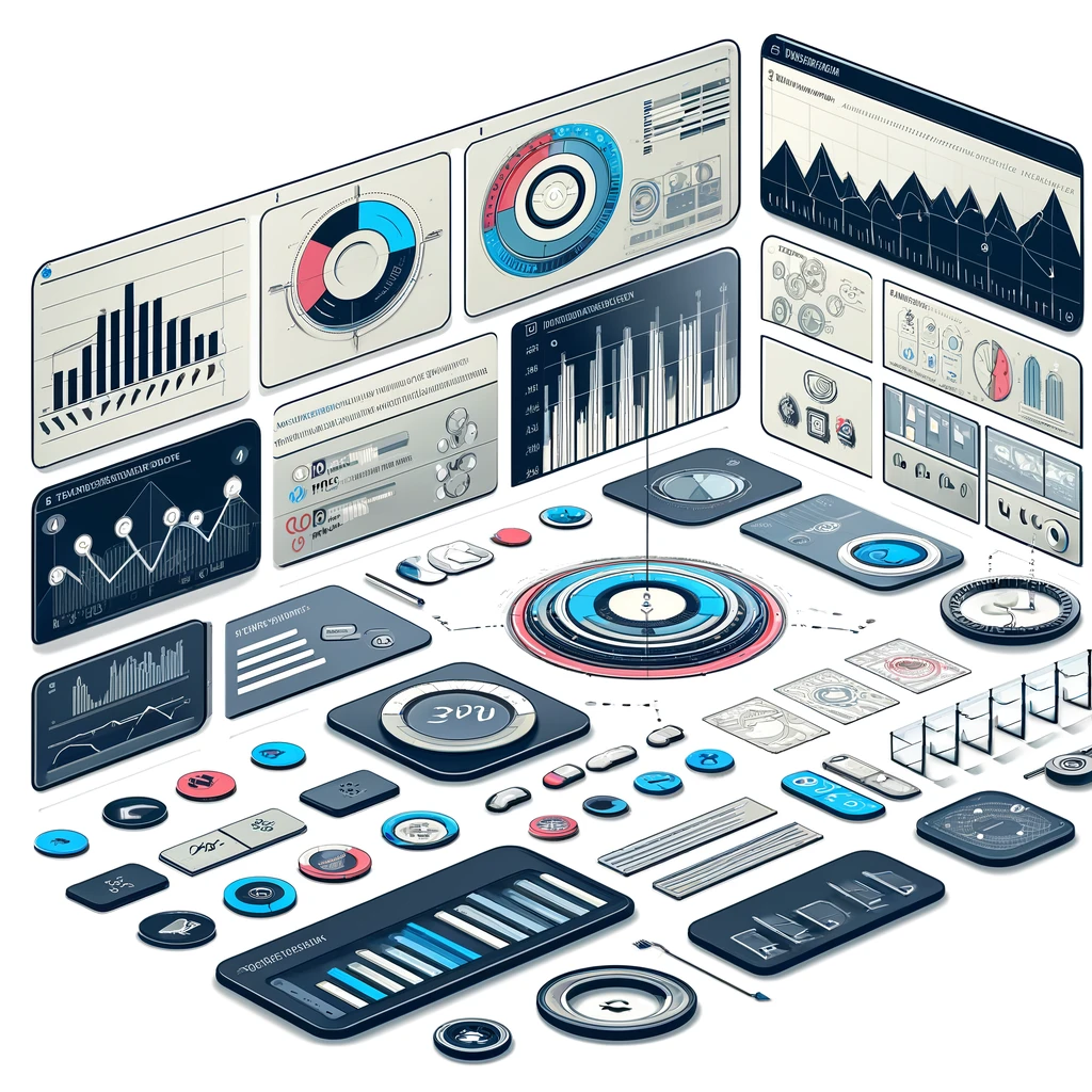

Dashboard Design for Desktop Platforms
Fundamentals of Dashboard Design for Desktop Platforms
Understanding the fundamentals of desktop dashboard design is key to creating an effective tool for data visualization and decision-making. Here’s an overview:
Definition and Purpose of Dashboards
- Overview: A dashboard is a visual display of the most important information needed to achieve one or more objectives, consolidated and arranged on a single screen.
- Purpose: The primary purpose of a dashboard is to provide a clear and concise overview of key performance indicators (KPIs) and critical data points relevant to business or operational objectives.
Key Differences Between Desktop and Mobile Dashboards
- Screen Size: Desktop dashboards can display more information due to larger screen sizes, whereas mobile dashboards are scaled down for smaller screens.
- Complexity and Detail: Desktop versions often allow for more complexity and detail, including more extensive graphs and charts, compared to the more streamlined mobile versions.
Essential Components of a Desktop Dashboard
- Data Visualization Tools: Include various types of charts, graphs, and gauges that are easy to read and understand.
- Real-Time Data Access: Provide capabilities for real-time data access to ensure the dashboard reflects the most current information.
- Interactive Elements: Incorporate interactive elements like dropdown menus, sliders, and drill-down capabilities for detailed analysis.
Understanding User Needs and Workflow
- User-Centric Design: The design of the dashboard should align with the specific needs and workflow of its users, ensuring it is intuitive and efficient.
- Customization: Allow for some degree of customization so users can tailor the dashboard to their specific needs and preferences.
Layout and Structure of Desktop Dashboards
The layout and structure of a desktop dashboard are crucial for its effectiveness. It’s about presenting complex data in a user-friendly manner. Here are some principles for creating an optimal dashboard layout:
Optimal Layout Principles for Desktop Viewing
- Logical Flow: Arrange elements in a logical flow that matches the user’s natural reading pattern, typically left to right, top to bottom.
- Priority Elements: Place the most important information or frequently used data points in the most prominent positions.
Organizing Information for Ease of Access
- Categorization: Group related information together to make the dashboard intuitive. This can be done through tabs, panels, or sections.
- Navigation: Ensure that navigation is straightforward, with clear labels and easy access to different dashboard sections.
Utilizing Grid Systems and Alignment
- Grid Layouts: Use grid systems to organize content. This helps in maintaining alignment and consistency throughout the dashboard.
- Balanced Composition: A grid system aids in creating a balanced and aesthetically pleasing composition, making the dashboard more appealing and easier to use.
Importance of White Space and Visual Hierarchy
- White Space: Don’t overcrowd the dashboard. Adequate white space enhances readability and reduces cognitive load.
- Visual Hierarchy: Establish a visual hierarchy to guide the user’s attention to the most important information first. This can be achieved through varying sizes, colors, or placement of elements.
Visual Design Elements
Effective visual design is essential in creating an engaging and user-friendly interface. Here’s how different elements of visual design contribute to the overall effectiveness of a product:
Color Schemes and Their Psychological Impact
- Color Choices: Colors can significantly affect how users perceive and interact with a design. Each color can evoke different emotions and reactions; for example, blue often instills a sense of trust and stability.
- Brand Alignment: Ensure color schemes align with the brand identity and the purpose of the design. Consistency in color usage reinforces brand recognition.
Choosing Fonts and Typography for Readability
- Readability: Select fonts that are easy to read, especially for longer texts. Sans-serif fonts like Arial or Helvetica are often good choices for digital interfaces.
- Font Size and Hierarchy: Use different font sizes and styles (like bold or italic) to create a visual hierarchy, making it easier for users to navigate through the content.
Incorporating Icons and Visual Indicators
- Icon Use: Icons can be powerful tools to convey information succinctly and visually. They should be intuitive and consistent in style.
- Visual Cues: Utilize visual indicators such as arrows, lines, or dots to guide users’ attention or to indicate actions and responses.
Balancing Aesthetics with Functionality
- Functional Beauty: While aesthetics are important, they should not overpower functionality. The design should enhance the user experience, not detract from it.
- Consistency: Ensure that the design elements are consistent throughout to avoid confusion and to reinforce usability.
Interactivity and User Engagement
Interactivity is a key component in enhancing user engagement, especially in digital products like dashboards and applications. Here’s how various interactive elements can be effectively integrated:
Interactive Elements like Buttons, Sliders, and Dropdowns
- Engagement Tools: Incorporate elements like buttons, sliders, and dropdown menus to make the interface interactive and user-friendly.
- User Control: These elements give users control over their experience, allowing them to interact with the content according to their preferences.
Dynamic Charts and Graphs for Data Representation
- Visual Data Interaction: Use dynamic charts and graphs that respond to user actions, such as hover effects that display more data, or clickable elements that delve deeper into the specifics.
- Real-Time Data Visualization: Implementing real-time data visualization in charts and graphs enhances the relevance and usefulness of the data presented.
Customizable Widgets and User Preferences
- Personalization: Offering customizable widgets or settings where users can set their preferences increases the usability and personal relevance of the application.
- User-Centric Design: Allow users to modify layouts, choose data points to display, or set notification preferences to tailor their experience.
Ensuring Intuitive Navigation and Controls
- Ease of Use: Navigation and controls should be intuitive and easy to use. Users shouldn’t have to struggle to find information or perform actions.
- Logical Flow: The arrangement of interactive elements should follow a logical flow, aligning with the typical user journey for smooth navigation.
Data Visualization and Analytics
Effective data visualization and analytics are crucial for conveying complex information in an understandable manner. Here’s a guide to best practices in this field:
Effective Techniques for Displaying Data
- Clarity and Simplicity: Focus on clarity and simplicity in your visualizations. Avoid clutter and unnecessary elements that could distract from the key message.
- Storytelling with Data: Use data to tell a story. Present it in a way that highlights trends, patterns, and insights clearly.
Selecting Appropriate Chart Types
- Match Data with Chart Type: Different types of data require different visualization approaches. For instance, line charts are ideal for trends over time, while pie charts are good for showing proportions.
- Comparative Analysis: Use bar or column charts for comparing different items, and scatter plots for showing relationships or distributions.
Real-Time Data Updates and Notifications
- Live Data Feeds: Implement real-time data updates for dynamic and current insights. This is especially important in fast-paced environments where data rapidly changes.
- Alerts and Notifications: Set up notifications or alerts based on specific criteria or thresholds to keep users informed of significant changes or anomalies in the data.
Tools and Software for Data Integration
- Integration Capabilities: Choose tools that can integrate data from various sources, providing a comprehensive view. Tools like Tableau, Microsoft Power BI, and Google Data Studio are popular choices.
- Customization and Flexibility: Look for software that offers customization options and flexibility to cater to specific business needs and user preferences.
Performance and Speed Optimization
Optimizing performance and speed is crucial for delivering a smooth user experience, particularly in data-intensive applications. Here’s how to enhance efficiency and reduce loading times:
Ensuring Fast Loading Times and Efficiency
- Content Delivery Networks (CDNs): Use CDNs to distribute the load, reducing the time it takes for data to travel from the server to the user.
- Optimize Images and Files: Ensure that images and files are compressed without significant loss of quality to reduce load times.
Optimizing Data Retrieval and Processing
- Efficient Database Queries: Optimize database queries to retrieve data as efficiently as possible. This involves structuring queries to minimize processing time and server load.
- Caching Strategies: Implement caching to store frequently accessed data temporarily, reducing the need to retrieve or process the same data repeatedly.
Balancing Rich Features with Performance
- Feature Load Management: Introduce features progressively or on-demand (lazy loading) instead of loading all features at startup.
- Performance Testing: Regularly conduct performance testing to identify features or elements that significantly impact loading times and optimize them accordingly.
Techniques for Minimizing Lag and Delays
- Asynchronous Loading: Load non-critical elements of the application asynchronously, so they do not block the loading of critical content.
- Optimize Scripts and Code: Minimize the use of heavy scripts and optimize the code for faster execution and reduced lag.
Accessibility and Inclusivity in Design
Creating accessible and inclusive designs is crucial to ensure that digital products are usable by all, including people with disabilities. Here’s how to approach this important aspect of design:
Adhering to Accessibility Standards
- Follow Guidelines: Adhere to established accessibility standards such as the Web Content Accessibility Guidelines (WCAG) to ensure your design meets basic accessibility requirements.
- Regular Updates: Stay updated with the latest standards and guidelines, as accessibility is an evolving field.
Designing for Diverse User Groups
- User Diversity: Consider the diverse needs of your user base, including those with disabilities, older users, and those with temporary impairments.
- Inclusive Design: Practice inclusive design by considering a wide range of abilities and preferences from the start of the design process.
Features for Visually Impaired and Dyslexic Users
- Screen Reader Compatibility: Ensure that your design is compatible with screen readers and provides alternative text for images and non-text content.
- Readable Fonts and Colors: Use fonts that are easy to read and ensure sufficient contrast between text and background colors. Consider dyslexic-friendly fonts and layouts.
Testing for Accessibility Compliance
- Automated Testing Tools: Utilize automated accessibility testing tools to identify potential issues in your design.
- User Testing: Conduct user testing with individuals who have disabilities to get direct feedback on the usability of your design.
- Continuous Improvement: Treat accessibility as an ongoing commitment. Continuously assess and improve the design for accessibility and inclusivity.
Security and Privacy Considerations
In the digital realm, ensuring the security and privacy of user data is paramount. Here’s how to approach these critical aspects:
Protecting User Data and Information
- Encryption: Implement strong encryption standards to protect user data, both in transit and at rest.
- Data Minimization: Collect only the data that is absolutely necessary, and store it only for as long as it is needed.
Implementing Secure Login and Authentication
- Strong Authentication Processes: Use multi-factor authentication (MFA) to add an extra layer of security to the login process.
- Password Policies: Enforce strong password policies and provide guidance to users on creating secure passwords.
Handling Sensitive Data Responsibly
- Access Controls: Implement strict access controls, ensuring that only authorized personnel have access to sensitive data.
- Data Handling Training: Regularly train staff on responsible data handling practices and the importance of data privacy.
Regular Updates and Security Patches
- Stay Updated: Regularly update software and systems to protect against known vulnerabilities.
- Security Audits: Conduct regular security audits to identify and fix potential security gaps.
Customization and Personalization
Customization and personalization enhance user experience by allowing users to tailor the interface and content to their specific needs and preferences. Here’s how to effectively implement these features in a dashboard:
Allowing Users to Tailor the Dashboard
- User-Controlled Layout: Enable users to modify the layout of the dashboard, such as rearranging or adding/removing widgets.
- Preference-Based Display: Allow users to choose what data they want to see, customizing the information displayed according to their interests or needs.
Personalized Alerts and Notifications
- Custom Alerts: Implement a system where users can set up personalized alerts based on specific criteria or thresholds relevant to their work or interests.
- Notification Preferences: Give users control over how and when they receive notifications, including frequency and channels (e.g., email, SMS, in-app).
Saving User Settings and Preferences
- Persistent Preferences: Ensure that the dashboard saves individual user settings and preferences, so they don’t have to reset them each time they log in.
- Profile-Based Customization: Allow users to create profiles that store their customization and personalization settings.
Balancing Customization with User Experience
- Intuitive Options: Ensure that customization options are intuitive and easy to use, enhancing the user experience rather than complicating it.
- Default Settings: Provide sensible default settings for users who prefer not to customize, ensuring the dashboard is effective and useful from the start.
Testing and User Feedback
Effective testing and user feedback are crucial for the development of a user-centric dashboard. Here’s how to incorporate these elements into the design process:
Conducting Usability Testing
- Prototype Testing: Test early versions of the dashboard with a group of target users to gather insights on its usability.
- Task-Based Analysis: Ask users to complete specific tasks using the dashboard and observe where they encounter difficulties or confusion.
Gathering and Implementing User Feedback
- Feedback Channels: Establish clear channels for users to provide feedback, such as surveys, interviews, or feedback forms within the dashboard itself.
- Actionable Insights: Analyze the feedback to identify common issues or suggestions, and prioritize these for implementation in the dashboard’s design.
Iterative Design for Continuous Improvement
- Ongoing Development: Treat the dashboard as a work in progress. Use an iterative design process, where each version incorporates feedback and learnings from the previous one.
- Adaptability: Be prepared to make changes to the dashboard based on evolving user needs and technological advancements.
Metrics for Measuring Dashboard Success
- User Engagement: Track metrics like usage frequency, session duration, and completion of key tasks to gauge user engagement.
- User Satisfaction: Measure user satisfaction through direct feedback, surveys, or Net Promoter Scores (NPS).
- Performance Metrics: Analyze performance metrics such as load time, error rates, and successful data retrievals to ensure the dashboard is functioning effectively.
FAQs: Dashboard Design for Desktop Platforms
1- What is the main purpose of a desktop dashboard?
A desktop dashboard serves as a visual tool to display key performance indicators (KPIs) and critical data points relevant to specific objectives, consolidated on a single screen for quick and efficient decision-making.
2- How do desktop and mobile dashboards differ?
Desktop dashboards generally offer more space for detailed data presentation and complex elements, while mobile dashboards focus on scaled-down, streamlined information for smaller screens and on-the-go accessibility.
3- What are essential components of a desktop dashboard?
Key components include diverse data visualization tools like charts and graphs, access to real-time data, and interactive elements like dropdown menus and sliders for in-depth analysis.
4- Why is understanding user needs vital in dashboard design?
A user-centric design ensures the dashboard aligns with users’ workflow and requirements, enhancing its intuitiveness and efficiency, and allowing for customized experiences.
5- What principles guide the optimal layout for a desktop dashboard?
Important principles include logical information flow, prioritizing key data, grouping related information for intuitive navigation, and using grid systems for organized content presentation.
6- How important are color schemes in dashboard design?
Colors greatly influence user perception and interaction. Choosing the right color scheme that aligns with the brand and the dashboard’s purpose can enhance readability and user experience.
7- What role do interactive elements play in dashboards?
Interactive elements like buttons and dynamic charts increase user engagement, providing control and a personalized experience, thereby making the dashboard more user-friendly and practical.
8- Why is data visualization crucial in dashboards?
Effective data visualization translates complex data into an understandable format, highlighting trends and insights, and making information easier to analyze and act upon.
9- How can performance and speed be optimized in dashboard design?
Optimizing performance involves ensuring fast loading times through efficient data retrieval, using content delivery networks, compressing images, and balancing rich features with overall dashboard speed.
10- What are best practices for ensuring dashboard accessibility?
Adhering to accessibility standards like WCAG, designing for diverse user groups, ensuring screen reader compatibility, and regularly testing for compliance are key to making dashboards accessible.
References and Links:
For authoritative and trustworthy resources related to dashboard design for desktop platforms, consider linking to these pages:
1- Best Practices in Dashboard Design:
Nielsen Norman Group: Dashboard Design Guidelines
2- Data Visualization and User Interface Design:
Tableau: Visualization Best Practices
3- Understanding User Needs in UI/UX:
Interaction Design Foundation: User Needs
4- Layout and Structure for Desktop Applications:
Smashing Magazine: Designing Desktop Applications
5- Color Theory and Design Psychology:
6- Typography in User Interface Design:
AIGA: Typography and User Interface Design
7- Interactive Design and Engagement:
UX Design Institute: Interactive Design
8- Accessibility in Digital Design:
Web Accessibility Initiative (WAI): Guidelines
9- Security Considerations in Web Development:
OWASP: Web Application Security
10- Customization and Personalization in Web Design: