

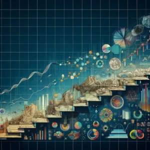
Graph Trend
The Evolution of Graphs in Data Visualization
Graphs have become an indispensable tool in data visualization, allowing for complex information to be represented in an understandable and accessible format. Their evolution reflects advancements in technology, analytical methods, and the increasing importance of data in decision-making.
Early History of Graphical Representation
The use of graphs for data representation dates back centuries, with early examples including timelines and cartographic maps. In the 17th and 18th centuries, pioneers like Christiaan Huygens and William Playfair began using graphical methods to represent quantitative information. Playfair, in particular, is credited with inventing several types of graphs, including the line, bar, and pie charts. These early developments laid the groundwork for the sophisticated graphical representations used today.
Breakthroughs in the 20th Century
The 20th century saw significant advancements in graph theory and practice. The development of statistical science and the increasing complexity of data required more advanced methods of data visualization. Innovators like John Tukey championed the use of graphs in statistical analysis, leading to the development of new graph types, including the box plot. These innovations made graphs an essential tool in various scientific and academic fields.
The Digital Revolution and Its Impact on Graphs
The digital revolution transformed the field of data visualization and the use of graphs. Computers enabled the processing of large data sets and the creation of more complex and interactive graphs. This era saw the development of dynamic and multidimensional graphs, capable of representing vast quantities of data in a clear and comprehensible manner. The ability to quickly generate and modify graphs revolutionized how data was analyzed and presented.
Modern Software and Graph Creation Tools
Today, a wide array of software and tools are available for creating graphs. These tools range from basic spreadsheet applications like Microsoft Excel to sophisticated data visualization software like Tableau and Power BI. These technologies allow users to create visually appealing and informative graphs with relative ease, catering to both expert analysts and those with minimal technical expertise.
The Role of Graphs in Big Data and Analytics
In the era of big data and analytics, graphs have become more crucial than ever. They play a key role in uncovering patterns, trends, and insights from large data sets, enabling data-driven decision-making in businesses, science, and policy-making. Graphs are also instrumental in machine learning and predictive analytics, where visual representations of data are essential for understanding complex algorithms and models.
Types of Graphs and Their Uses in Data Visualization
Data visualization employs various types of graphs, each designed to present information in the most effective way possible. Understanding the uses of different graph types is crucial for accurately interpreting data and making informed decisions. Here’s a look at some common and advanced types of graphs and their specific applications.
Line Graphs: Tracking Changes Over Time
Line graphs are one of the most widely used tools for displaying data trends over time. By plotting data points on an X (horizontal) and Y (vertical) axis and connecting them with lines, they provide a clear visual representation of changes or movements. Line graphs are particularly useful in finance for tracking stock prices, in meteorology for displaying temperature changes, or in business for showing sales trends over different periods.
Bar Charts and Histograms: Comparing Quantities
Bar charts and histograms are effective for comparing quantities across different categories. In a bar chart, bars of varying lengths represent different data values, making it easy to compare. Bar charts are versatile and can be used in various settings, from business (comparing revenue or expenses across different departments) to education (showing the number of students enrolled in different courses). Histograms, similar to bar charts but used for frequency distribution, are commonly used in statistics to show the distribution of a dataset.
Pie Charts: Visualizing Proportions and Percentages
Pie charts are used to represent data in a circular format, showing the proportion or percentage that each category contributes to the whole. They are best used when you want to show how different parts make up a whole, such as the market share of different companies in an industry or the percentage of a budget allocated to various departments.
Scatter Plots: Identifying Correlations and Trends
Scatter plots display values for two variables for a set of data on a Cartesian coordinate system. By looking at the spread of data points, one can identify correlations and trends. Scatter plots are particularly useful in scientific and medical research to identify potential relationships between variables, such as the correlation between drug dosage and patient response.
Advanced Graph Types: Heat Maps, Tree Maps, and Network Diagrams
- Heat Maps: Used to represent complex data sets visually, heat maps use colors to represent values, allowing easy identification of trends, outliers, and patterns. They are widely used in areas like geography for weather patterns, in biology for gene expression levels, and in web analytics for showing user activity on a page.
- Tree Maps: These display hierarchical data as a set of nested rectangles. Each branch of the tree is given a rectangle, and each sub-branch is then represented as a smaller rectangle within it. This type of graph is useful for visualizing complex organizational structures or file systems.
- Network Diagrams: Used to represent relationships and flows between elements or entities, network diagrams are vital in fields such as sociology, information technology, and business logistics. They help in visualizing complex networks like social networks, transportation systems, or communication networks.
Graph Design Principles: Crafting Clear and Effective Visualizations
Effective graph design is essential for accurately conveying information and facilitating understanding. Good graph design balances clarity, simplicity, and aesthetics while avoiding common pitfalls that can lead to misinterpretation or confusion.
Importance of Clarity and Simplicity
Clarity and simplicity are foundational in graph design. The primary goal is to present data in a way that is easy to understand and interpret. This involves choosing the right type of graph for the data, avoiding clutter, and focusing on presenting the data as clearly as possible. A well-designed graph should convey its message at a glance, without overwhelming the viewer with unnecessary details or complex layouts.
Color Theory in Graph Design
Color plays a crucial role in graph design. It can be used to distinguish different data sets, draw attention to key information, or convey a certain mood or theme. However, it’s important to use color judiciously:
- Choose colors that have enough contrast to be easily distinguishable.
- Be mindful of colorblindness; avoid color combinations that might be difficult for colorblind viewers to differentiate.
- Use color consistently throughout a graph to maintain coherency.
- Avoid using too many colors, which can lead to confusion and visual overload.
Effective Use of Labels and Legends
Labels and legends are key to making a graph understandable. They should be clear, concise, and placed strategically to help the viewer easily connect them to the corresponding parts of the graph. Labels should be in a readable font size and style. Legends should be well-organized and positioned where they can be easily found without distracting from the main data presentation.
Balancing Aesthetics and Functionality
While aesthetics are important in graph design, they should not overshadow functionality. The design should enhance the ability to read and understand the data, not detract from it. This means:
- Avoiding decorative elements that don’t serve a functional purpose.
- Using whitespace effectively to avoid a cramped or cluttered appearance.
- Choosing fonts and sizes that are legible and harmonious with the overall design.
Common Graph Design Mistakes to Avoid
Several common mistakes can undermine the effectiveness of a graph:
- Overcomplicating the graph with too much information or too many features.
- Using 3D effects that can distort the viewer’s perception of the data.
- Choosing inappropriate graph types that misrepresent the data or make it harder to understand.
- Not providing context or explanations for the data, leaving viewers confused about what they are seeing.
Graphs in Business and Economics: Visualizing for Success
In the realms of business and economics, graphs play a vital role in analyzing, understanding, and communicating complex data. They are instrumental in financial analysis, market trend interpretation, project management, and more, aiding decision-makers in navigating the business landscape effectively.
Graphs for Financial Analysis
Graphs are essential tools in financial analysis, offering visual representations of financial data that might otherwise be difficult to interpret. Common types include:
- Line Graphs: Used to track stock prices, revenue growth, or interest rates over time.
- Bar Charts: Helpful in comparing financial metrics like quarterly sales, profits, or expenses across different departments or time periods.
- Pie Charts: Utilized for visualizing budget allocations or revenue sources.
Market Trends and Consumer Data Visualization
Understanding market trends and consumer behavior is crucial in business and economics. Graphs such as scatter plots can reveal correlations between variables, helping businesses identify market opportunities or consumer preferences. Trend lines in line graphs are used to forecast future market behaviors, while bar charts can compare consumer data across different demographics.
Project Management and Performance Tracking
In project management, graphs are used to track progress and performance against timelines and objectives. Gantt charts, a type of bar chart, are widely used for scheduling and monitoring the stages of a project. Dashboards filled with various graphs provide real-time views of key performance indicators, helping managers stay informed and make timely decisions.
Case Studies: Effective Use of Graphs in Business
Numerous businesses have leveraged the power of graphs for strategic advantage. For instance, a retail company might use heat maps to analyze store traffic and optimize layout. A tech company might employ line graphs to track website traffic and user engagement over time. These case studies demonstrate how effective use of graphs can lead to improved strategies and business outcomes.
Future Trends in Business Data Visualization
The future of data visualization in business is likely to be characterized by greater interactivity and advanced technologies. Interactive dashboards will allow users to explore data in more depth, customizing graphs to suit their specific needs. Advancements in AI and machine learning could lead to more predictive and insightful graphs, capable of offering foresight into market trends and consumer behaviors. Additionally, the integration of virtual reality and augmented reality in data visualization could provide immersive and more intuitive ways of interacting with complex data sets.
Graphs in Science and Research: A Tool for Clarity and Insight
Graphs are a fundamental element in science and research, playing a critical role in analyzing, interpreting, and communicating complex data. Their usage spans various fields, from environmental studies to medical research, aiding scientists and researchers in presenting their findings effectively.
Graphs in Academic Journals
In academic journals, graphs are used extensively to present research findings clearly and concisely. They help in visualizing data trends, comparing results, and illustrating relationships between variables. Common graph types in academic publications include line graphs, bar charts, and scatter plots. These visual aids are crucial for readers to understand the research outcomes, particularly when dealing with large datasets or complex experiments.
Data Presentation in Environmental Studies
Environmental studies often involve large sets of data related to climate, ecosystems, and pollution levels. Graphs such as line graphs are used to track changes in temperature or sea levels over time, while pie charts might illustrate the distribution of various greenhouse gases. Maps and heat maps are particularly valuable in showing geographical patterns and the impact of environmental factors in different regions.
Graphs in Medical Research and Healthcare
Graphs are indispensable in medical research and healthcare for presenting data on disease trends, patient outcomes, and treatment efficacy. Line graphs can show the progression of disease symptoms over time, while bar charts can compare the effectiveness of different treatments. In epidemiology, graphs are essential for tracking the spread of diseases and the impact of public health interventions.
The Role of Graphs in Communicating Complex Information
Graphs play a vital role in making complex information accessible and understandable. In scientific research, where findings can be intricate and data-intensive, graphs simplify information and highlight key insights. This clarity is essential not just for the scientific community, but also for communicating with the public, policymakers, and other stakeholders.
Ethical Considerations in Scientific Graphs
While graphs are powerful tools for data presentation, ethical considerations are paramount in their creation and use. It’s crucial to represent data accurately and without bias. Misrepresentation, either through distorted scales, cherry-picked data, or misleading formats, can lead to incorrect conclusions and undermine public trust in scientific research. Scientists and researchers must adhere to ethical standards in graph design to ensure the integrity and credibility of their work.
Educational Applications of Graphs: Enhancing Learning and Understanding
Graphs play a crucial role in education, serving as valuable tools for teaching, learning, and illustrating complex concepts. Their applications span various subjects and educational levels, aiding in developing critical thinking and data literacy skills among students.
Teaching Graph Literacy in Schools
Graph literacy is an essential skill in today’s data-driven world, and its foundation is laid in schools. Educators teach students how to read, interpret, and create graphs, equipping them with the ability to analyze and draw conclusions from data. This includes understanding different types of graphs, learning to identify trends and patterns, and grasping how to present data effectively through graphical means.
Interactive Graphs and Learning Tools
The advent of digital technology has introduced interactive graphs and learning tools into the classroom, enhancing the educational experience. Interactive graphs allow students to manipulate variables and see real-time changes, facilitating a deeper understanding of the subject matter. These tools are particularly effective in subjects like science and mathematics, where dynamic visualizations can illustrate complex theories and principles.
Graphs in Mathematics and Statistics Education
In mathematics and statistics education, graphs are indispensable for teaching concepts such as functions, probability, and statistical distributions. Line graphs, bar charts, and histograms help students visualize mathematical relationships and statistical data, making abstract concepts more concrete and understandable. Graphing calculators and software programs are also widely used, enabling students to explore these concepts more interactively.
The Role of Graphs in Online Learning Platforms
Online learning platforms extensively use graphs to teach and illustrate various subjects. Graphs in digital formats are particularly useful for self-paced learning, as they can offer detailed explanations and allow students to explore different aspects of the data. Video lectures often incorporate graphs to aid in explaining topics, while online quizzes and exercises use them to test students’ understanding and interpretation skills.
Student Projects Involving Graph Creation
Creating graphs is a common assignment in many educational programs, encouraging students to engage actively with data. Projects may involve collecting data through experiments or research, followed by analysis and presentation using appropriate graphs. These projects not only enhance students’ graph literacy but also develop their research and analytical skills, preparing them for higher education and professional environments.
Graphs in the Digital Age: Navigating the New Frontiers of Data Visualization
The digital age has revolutionized how we create, interact with, and interpret graphs. The transition from static to dynamic and interactive graph formats has significantly enhanced our ability to understand and communicate complex information.
Interactive and Dynamic Graphs in Digital Media
Digital media has brought about the advent of interactive and dynamic graphs, allowing users to engage with data in a more meaningful way. These graphs enable users to explore different facets of data by zooming in, filtering, or clicking on specific elements for more detailed information. This interactivity transforms the experience from passive observation to active exploration, making it easier to uncover deeper insights from data.
Data Journalism and the Use of Graphs
Data journalism, which involves the use of large data sets to tell news stories, heavily relies on graphs to convey complex information succinctly and compellingly. Graphs in data journalism are used to break down and illustrate intricate stories, making them more accessible and engaging to the audience. They help in distilling vast amounts of data into easily digestible visual formats, enhancing the impact and reach of journalistic stories.
Mobile Applications and Graph Accessibility
The rise of mobile technology has necessitated the adaptation of graphs for small screens, ensuring that data visualization is effective and accessible on mobile devices. Mobile applications often use simplified graphs with larger, touch-friendly elements, optimized for smaller displays. This advancement has made graphs more accessible to a wider audience, allowing people to interact with data on-the-go.
Augmented Reality and Virtual Reality Graphs
Augmented Reality (AR) and Virtual Reality (VR) technologies are beginning to be used for graph visualization, offering immersive and interactive experiences. In AR and VR, users can interact with three-dimensional graphs in a virtual space, providing a novel way of exploring and understanding complex datasets. This technology is particularly promising in fields like education, engineering, and scientific research, where understanding spatial relationships and multi-dimensional data is crucial.
The Future of Graph Interaction and Display
Looking ahead, the future of graph interaction and display is likely to be marked by further advancements in technology, making data visualization even more interactive, immersive, and accessible. Artificial Intelligence (AI) could play a role in creating more intuitive and responsive graphs, while advancements in display technology could lead to more sophisticated and high-resolution visualizations. The ongoing evolution in this field promises to make graphs an even more powerful tool for understanding and communicating data in the digital age.
The Art of Storytelling with Graphs: Weaving Narratives in Data Visualization
Graphs are not just tools for displaying data; they are also powerful storytelling mediums. The art of using graphs to tell stories lies in the ability to transform data into a compelling narrative that engages and informs the audience.
The Narrative Power of Data Visualization
Data visualization, through graphs, has a unique narrative power. It can turn complex data sets into understandable stories, making the abstract tangible and the invisible visible. A well-crafted graph can highlight trends, reveal insights, and convey a story that numbers alone cannot. This narrative power is invaluable in areas ranging from business and journalism to education and social sciences.
Case Studies of Storytelling Through Graphs
Various case studies showcase the effectiveness of storytelling through graphs. For example, climate change graphs that illustrate rising global temperatures over decades powerfully communicate the urgency of the issue. In business, a company’s growth story can be effectively told through line graphs depicting sales or profit trends over the years. These examples demonstrate how graphs can bring clarity and impact to complex topics.
Techniques for Creating Compelling Graph Narratives
Creating a compelling graph narrative involves several key techniques:
- Focus on the Message: Determine the key message or story the data should convey and design the graph around it.
- Use Clear and Simple Visuals: Avoid cluttered or overly complex designs that can distract from the story.
- Highlight Key Data Points: Use colors, labels, or annotations to draw attention to important parts of the graph.
- Provide Context: Background information and data sources give credibility and help the audience understand the bigger picture.
- Engage Emotionally: Design the graph in a way that resonates emotionally with the audience, making the data more relatable and impactful.
The Role of Context in Graph Interpretation
Context is crucial in interpreting graphs. A graph without context can be misleading or open to misinterpretation. Providing background information, explaining the data sources, and outlining the circumstances under which the data was collected helps the audience understand and trust the story the graph is telling.
Bridging Data and Emotion in Graph Design
An effective graph not only conveys data but also connects with the audience on an emotional level. This can be achieved by focusing on aspects of the data that resonate with common human experiences or by using design elements that evoke an emotional response. The goal is to make the audience care about the data, transforming numbers into a narrative that has both logical and emotional appeal.
Technological Advances in Graph Creation: Navigating the Future of Data Visualization
The field of graph creation has been significantly influenced by technological advancements, particularly in areas like automation, AI, and big data. These developments are shaping the future of how we create, interpret, and interact with graphs.
Automated Graph Generation Tools
Automated graph generation tools have streamlined the process of creating graphs, making it more efficient and accessible. These tools can quickly transform raw data into visual formats, selecting the most appropriate type of graph based on the data’s characteristics. This automation not only saves time but also makes graph creation more user-friendly for those with limited technical or design expertise.
AI and Machine Learning in Graph Analysis
AI and machine learning are playing an increasingly significant role in graph analysis. These technologies can analyze large data sets, identify patterns and trends, and even predict future outcomes. Machine learning algorithms are used to create more sophisticated and insightful graphs, especially in complex fields like market analysis, scientific research, and social network analysis.
The Role of Big Data in Advanced Graph Types
The rise of big data has led to the development of advanced graph types capable of handling and representing vast amounts of information. Complex data sets require innovative visualization techniques to be understood effectively. This need has driven the creation of advanced graphs like interactive 3D models, network diagrams, and real-time data dashboards.
Future Technologies Shaping Graph Creation
Looking ahead, several technologies are poised to further influence graph creation. Augmented Reality (AR) and Virtual Reality (VR) could offer immersive ways to interact with data visualizations, making complex graphs more tangible and understandable. Blockchain technology might also play a role, particularly in the transparent and secure tracking of data used in graph creation.
Ethical Considerations in Automated Data Visualization
With the increased use of automated tools and AI in graph creation, ethical considerations are becoming crucial. It’s essential to ensure that these technologies do not introduce biases or misrepresentations into the visualizations. Transparency in how algorithms process and visualize data is necessary to maintain the integrity and credibility of the graphs produced.
Global Trends and Cultural Differences in Graph Usage
Graph usage and data visualization practices vary across cultures, reflecting different approaches to communication, aesthetics, and information processing. Understanding these global trends and cultural nuances is essential for effective cross-cultural communication in an increasingly interconnected world.
Graphs in Different Cultural Contexts
Cultural context can significantly influence how graphs are designed and interpreted. For instance, color usage in graphs can have different connotations in various cultures. Red might indicate danger or urgency in some contexts, while in others, it could represent prosperity. Similarly, the direction of reading a graph (left to right, right to left) might vary depending on the predominant reading direction in a culture. These nuances highlight the importance of cultural awareness in graph design and interpretation.
Global Trends in Data Visualization
Data visualization has become a global language, but its application can be influenced by regional trends and technological advancements. In some regions, innovative and complex graph types, such as interactive 3D models or real-time data dashboards, are more prevalent, often driven by higher technological adoption. In other regions, traditional graph formats remain dominant, reflecting varying levels of access to technology and differing preferences in data presentation.
Cross-Cultural Communication through Graphs
Graphs are powerful tools for cross-cultural communication, offering a visual means to present data that can transcend language barriers. However, effective cross-cultural communication requires mindfulness about how data is presented. This involves considering cultural perceptions of visual elements and ensuring that the graphs are accessible and understandable to diverse audiences.
Case Studies: International Approaches to Graph Design
There are insightful case studies on international approaches to graph design. For example, in Japan, there is often an emphasis on detail and precision in graphs, reflecting broader cultural values. In contrast, European or American graph designs might prioritize simplicity and directness. These case studies underscore the diversity in graph design approaches and the influence of cultural values and norms.
The Future of Global Data Visualization Collaboration
The future of global data visualization collaboration is promising, with increased opportunities for sharing knowledge and techniques across cultures. This collaboration could lead to the development of universally accessible and culturally sensitive graph designs. Additionally, international forums and conferences on data visualization provide platforms for professionals from various backgrounds to exchange ideas and innovate in graph design and usage.
FAQs: Graph Trends in Data Visualization
1- What is the historical significance of graphs in data visualization?
Graphs have a long history in data representation, dating back to ancient times with uses in timelines and cartographic maps. Key developments in the 17th and 18th centuries by figures like William Playfair laid the groundwork for modern graphical representations.
2- How did the digital revolution affect graph use and design? The digital revolution led to significant advancements in graph design and use, enabling the processing of large datasets and the creation of complex, interactive graphs. This era marked the development of dynamic and multidimensional graphs, revolutionizing data analysis and presentation.
3- What are the modern tools available for graph creation? Modern tools for graph creation range from basic applications like Microsoft Excel to advanced data visualization software like Tableau and Power BI. These technologies allow users to create intricate and visually appealing graphs with ease.
4- Why are graphs important in the era of big data and analytics? In the era of big data, graphs are crucial for uncovering patterns and insights from large datasets, enabling data-driven decision-making in various sectors like business, science, and policy-making.
5- Can you describe different types of graphs used in data visualization? Common graph types include line graphs (for tracking changes over time), bar charts and histograms (for comparing quantities), pie charts (for visualizing proportions), and scatter plots (for identifying correlations). Each type serves a specific purpose in representing data.
6- What are some key principles in effective graph design? Effective graph design principles include clarity, simplicity, and appropriate use of color. It’s important to use labels and legends for understanding, balance aesthetics with functionality, and avoid common design mistakes like over-complication or inappropriate graph types.
7- How do graphs contribute to business and economics? In business and economics, graphs are used for financial analysis, understanding market trends, project management, and tracking performance. They aid in decision-making by providing visual insights into complex data.
8- What is the role of graphs in science and research? In scientific research, graphs are vital for presenting data clearly and concisely. They help visualize trends, compare results, and illustrate relationships, making complex information more accessible.
9- How are graphs used in educational settings? In education, graphs are used to teach and illustrate various subjects, especially in mathematics and science. They aid in developing critical thinking and data literacy skills, with applications ranging from classroom teaching to student projects.
10- What impact has the digital age had on graphs and data visualization? The digital age has transformed data visualization with interactive and dynamic graphs, making data interpretation more engaging. The use of technologies like AR and VR in graph visualization is also emerging, providing immersive ways to interact with data.
References and Links:
1- Art of Visualization: History and Evolution of Data Visualization
https://www.artofvisualization.com/blog/history-and-evolution-of-data-visualization
2- Tableau: The History of Data Visualizations – From Cave Drawings to Tableau
https://www.tableau.com/whitepapers/designing-great-visualizations